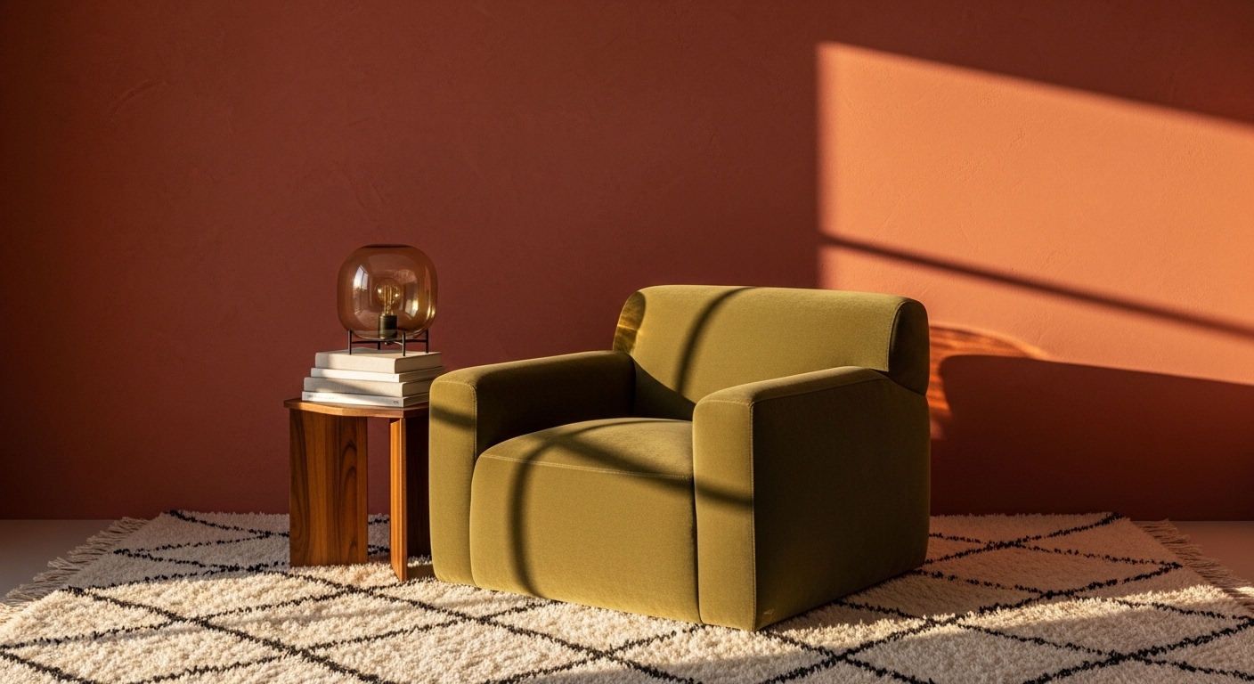
For years, we’ve been told that “Grey and White” is the only way to achieve a modern home. But in 2026, we are witnessing the rise of Sensory Design. This isn’t just about how a room looks—it’s about how the colors and textures affect your nervous system.
If your home feels “flat,” it might be time to move beyond the beige and embrace the files on Color Psychology.
1. The “Earth Connection” (Terracotta & Sage)
According to our 2026 Style Files, earth tones are replacing stark whites. Why? Because shades of clay and moss green lower heart rates and ground the room.
- The Move: Swap your white pillows for a deep “Burnt Sienna” or “Olive” to immediately warm up a sterile living room.
2. Texture as a “Tactile Reset”
Minimalism often fails because it’s too “hard.” Sensory design introduces tactile variety. A cold marble table should be paired with a soft, chunky wool rug.
- The System: Use the 80/20 rule—80% smooth surfaces, 20% high-texture fabrics.
3. “Dopamine” Accents
You don’t have to go full Maximalist to enjoy color. In The Edit, we recommend the “Single Point of Joy” method. Choose one object—a cobalt blue glass vase or a mustard yellow velvet chair—that makes you smile every time you see it.
4. Scented Architecture
A curated space isn’t complete until it has a signature scent. In 2026, we are moving away from “sweet” candles and toward “architectural” scents: Sandalwood, Palo Santo, and Hinoki.